
Cholera 1855 in Basel: Between History, Epidemiology and Geographic Visualisation
In 1854, Dr. John Snow creates a map of cholera cases in London’s Soho district. He can thus show that the disease is transmitted through contaminated water. In her Master’s thesis, Inga Birkhölzer investigated what can be extracted today from the cholera figures of 1855 in Basel using geographical visualisation.
Den Blogbeitrag auf Deutsch lesen 🇩🇪
Inga Birkhölzer, while searching for a topic for her master’s thesis in geography, has a part-time job at the Institute for Evolutionary Medicine at UZH. She is digitising old health bulletins for the Past Pandemics project. “I did not plan from the start to combine these two research areas in my Master’s thesis,” she says with a smile and adds: “I only knew that I wanted to write my Master’s thesis in the field of geovisualisation with Prof. Dr. Sara Fabrikant.” However, Inga was unaware that Sara and PD Dr. phil. Kaspar Staub, her current employer, knew each other and had previously worked together on a project investigating the Spanish flu using GIS. “When we had clarified this and Sara suggested the reconstruction of the 1855 cholera epidemic in Basel as a topic for Inga’s thesis, I immediately thought it would be a good fit”, Inga says.
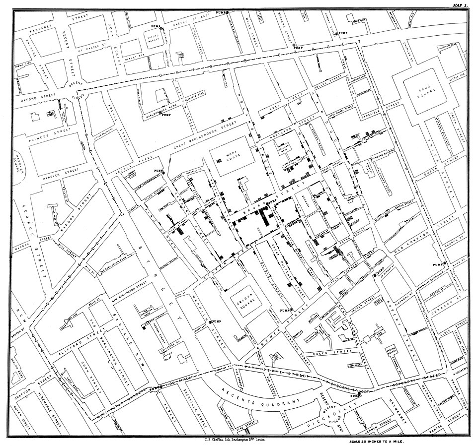
Inga was already familiar with John Snow’s map from numerous lectures where it was frequently presented. “John Snow’s approach is just one of many ways to visualize data. My work is about what can be extracted from case numbers and additional data nowadays with a GIS to reconstruct the cholera epidemic”, Inga summarises. However, before Inga could begin visualizing the data, she had to gather and process various datasets to integrate them into the GIS software.
From case numbers to wells to the census
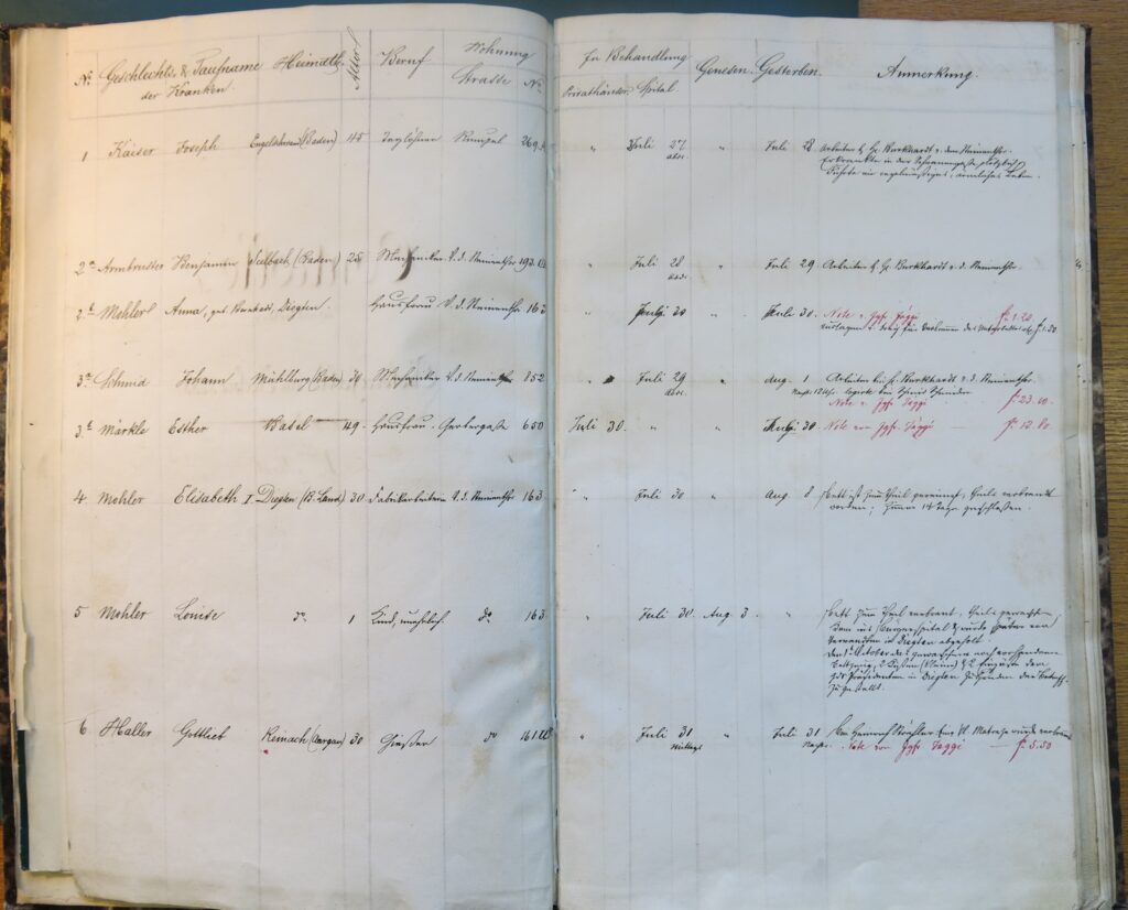
Cholera raged in Basel from the end of July to the end of September 1855. Almost 400 people were infected, and half of them succumbed to the disease. The authorities of the time recorded the epidemic by hand and these records are now stored in the State Archive of Basel-Stadt. They served as a data source for Inga, as she explains: “I had photos of these files and first had to prepare the data manually.” Specifically, Inga deciphered each entry and typed it into a table, recording the name, age, gender, occupation, and address of each person infected, along with the date of infection, whether they stayed at home or went to the hospital and the date of recovery or death
To link the addresses to space, they had to be georeferenced. “Georeferencing, i.e. assigning unique coordinates to each entry, proved to be a challenge as the address system had changed since 1855. So, I couldn’t just match them with a local encyclopaedia”, Inga explains. She sought assistance from the surveying office of the canton of Basel-Stadt, which had already georeferenced the old addresses for a previous project. “With their help, I was able to match 382 of the 399 addresses and display the cases per address on a map”, she says.
To accurately depict the city of Basel during the cholera epidemic, Inga georeferenced a situation map by the geometer Ludwig Heinrich Loeffel from 1862. Census data from the Bürgerforschung Basel helped her relate cholera cases to the population density. “The census data had already been digitized for 1850 and 1860; I used the data from those two years to approximate the data for 1855”, Inga says. For the geographic context, Inga worked with the land surveying office of Basel-Stadt to digitize the districts of that time period. “The districts themselves have changed over time, but so has the course of the Rhine, which flows through the middle of the city. We had to take all that into account in the geometry of the districts”, she explains. She then assigned both the census and cholera cases to the individual districts.
“The wells, which are part of the drinking water supply, play a crucial role in the spread”, Inga informs, explaining how she determined the locations of the wells in 1855: “Instead of recording each well individually, I started from the current data set of the Industrielle Werke Basel and kept all the locations that were also present on Loeffel’s map from 1862.” All other wells were removed. Inga repeated this process with two other old sources and was left with 389 wells. However, after considering only the publicly available ones, Inga narrowed it down to 58 wells for further analysis.
Off to the map
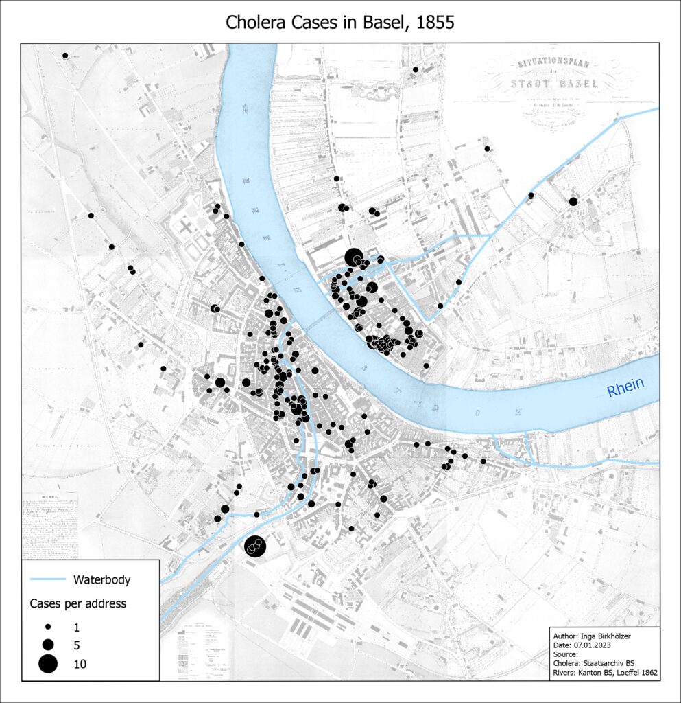
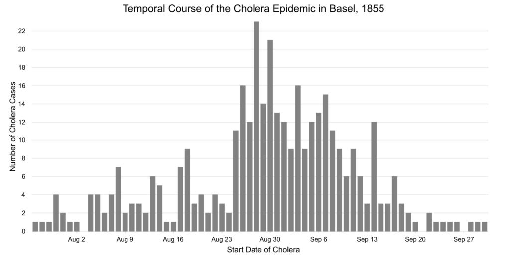
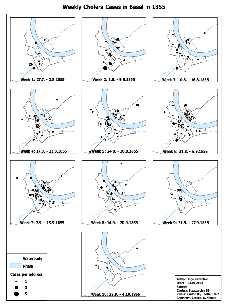
With all this data, Inga was now able to display the course of the cholera epidemic statistically and cartographically in ArcGIS Pro. “On the one hand, I plotted the number of cases over time in a histogram, and on the other hand, I mapped the cases per address. The map indicates that the cases are mainly concentrated in the urban areas, including Greater Basel and Kleinbasel”, Inga says, pointing to the map below.
“In addition, I mapped the cases per household and week to show the evolution of the epidemic over time and space”, Inga says.
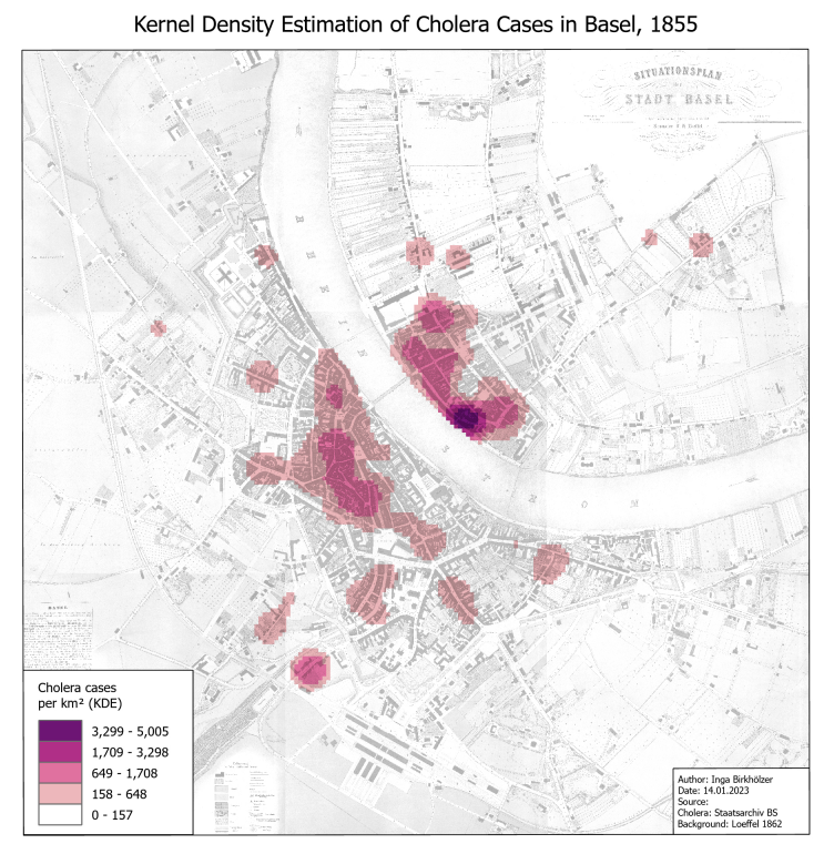
The high concentration of cases in urban areas is even better visible on the density map (Kernel Density Estimation), which indicates the number of cases per square kilometre. “Kleinbasel in the Rhine loop was particularly hard hit”, Inga highlights.
To determine the wells with the highest number of cases, Inga calculated Thiessen polygons around the wells. “The Thiessen polygons represent the catchment area of the wells, meaning that for each point within the polygon, the closest well is located in the centre. By calculating the number of cases per polygon, a density surface similar to the map above can be obtained”, Inga explains.
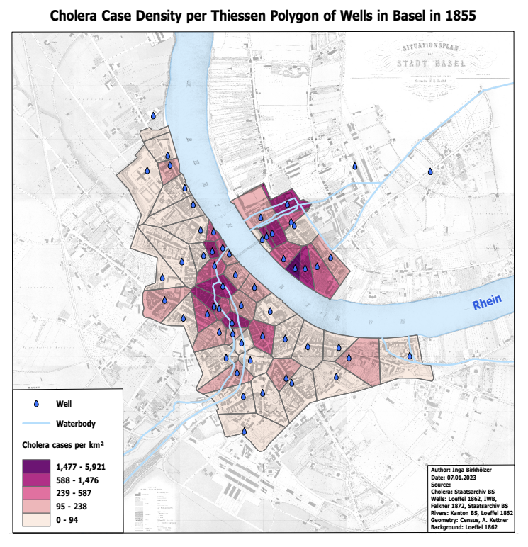
“The area with the highest density of cases is near Rheingasse in Kleinbasel”, Inga elaborates, “It has been documented that the fountain in that area was closed by authorities due to suspicion of pollution from sewage in the streets above. However, the date of closure is unknown.” High densities are also found along the Birsig River in Grossbasel. The reason is not clear according to Inga: “Since topography and river flow are interdependent, it is difficult to say whether the river serves as a sewer or if contaminated liquids flowing downstream due to the topography are responsible for the high densities.”
The added value of digitization and visualization
In 1855, the transmission routes of cholera were not yet known, but authorities had identified high-risk areas, according to Inga. Her master’s thesis contributes to reconstructing the course of the epidemic. “At the same time, it identifies risk factors for the spread of cholera that are still relevant today, because cholera is still widespread in various countries”, she adds. Inga believes that this information can help to take appropriate measures to prevent not only cholera but also other infectious diseases. In addition, Inga has digitized a large amount of data that can be used for further research by the group Historic Epidemiology. “The data has a lot of potential: You could use it to create an interactive map or do more research on the background of the people, for example, which population group was most affected. Further, with a survival time analysis, you could find out which variable(s) influence survival time”, Inga explains.
MSc Thesis
Inga Birkhölzer (2023): Reconstructing the 1855 Cholera Epidemic in Basel Using Geographic Information Visualization
Inga Birkhölzer accomplished her master’s degree in geography with a specialization in Geographic Information Science and Systems at UZH in the spring of 2023. Currently, she works as a GIS developer at the civil engineering and construction planning office of F. Preisig AG. During her master’s thesis, she had already worked at the same office with a reduced workload. Inga brings to her job the technical competencies and ArcGIS skills that she acquired during her geography studies, as well as her ability to think holistically and handle various types of data.

This article first appeared in the GIS Hub Blog of the Digital Society Initiative of the University of Zurich.
Katia Soland, GIS Hub Coordinator, Digital Society Initiative (DSI)